Architects: Johnston Marklee & Associates
Location: Pacific Palisades, California, USA
Project year: 2004
Project Architects: Mark Lee, Sharon Johnston AIA, Jeff Adams, Mark Rea Baker
Project team: Diego Arraigada, Brennan Buck, Michelle Cintron, Daveed Kapoor, Anne Rosenberg, Anton Schneider
Developer: Lucas Ma (President, Markee LLC)
Client: Chan Luu
Contractor: Hinerfeld-Ward, Inc.
Structural Engineer: William Koh & Associates
Lighting Consultant: Dan Weinreber
Landscape: DLush Life LA
Photographs: Eric Staudenmaier
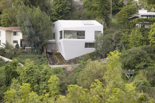
Completed in October 2004, the Hill House was designed under challenging conditions generated by modern problems of building on a hillside. Located in Pacific Palisades, California, while the site for the house offers panoramic views from Rustic and Sullivan Canyons to Santa Monica Bay, the irregularly shaped lot is situated on an uneven, downhill slope. With the canonical Eames House nearby, the 3300 square foot Hill House provocatively continues the Case Study House tradition of experimentation and reinvention of Los Angeles lifestyles.
HILLSIDE ZONING
Increasingly in Los Angeles, local hillside ordinances, building codes, coastal regulations, and design review boards have imposed restrictions on hillside construction, with the goal of preserving the profile of the natural hillside terrain by limiting building heights, location and massing. The Hill House sets a new precedent for hillside building by liberating itself from these restraints - not through evasion - but by strategically transforming these stringent criteria into a sculptural and efficient design solution, that seamlessly engages with the surrounding site.
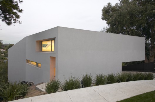
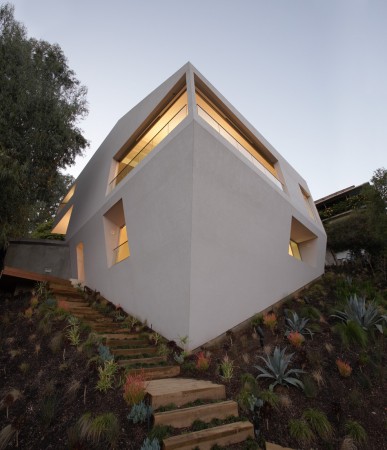
The massing of the Hill House subsequently results from two economically driven development criteria: To maximize the volume allowed by the zoning requirements; and to minimize contact with the natural terrain. Recalling Hugh Ferriss's vision of a Manhattan skyline literally interpreting the zoning laws as building form, the Hill House adopts the maximum zoning envelope as its form. The initial envelope is shaped from a combination of property setbacks in plan and hillside height restrictions in section, and is further refined three-dimensionally according to structural criteria.
PLANNING
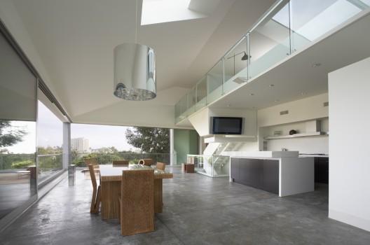
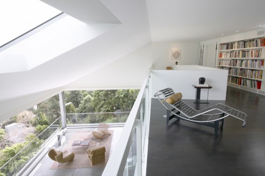
Within the building enclosure, individual programmatic components are assembled to fit into the fixed envelope, much like a contortionist, artfully compressing the mass of their body into unique configurations. By eroding all non-structural walls and partitions, the program flows effortlessly between three levels stacked within the exterior skin. An upper semi-private loft space and a more secluded lower bedroom suite sandwich the central public living and dining area. An open, sculptural, steel and glass stair vertically stitches the three levels together. The smooth polished interior skin is shaped and curved selectively to accentuate the geometry of the house and to accommodate storage and mechanical services.
APERTURES
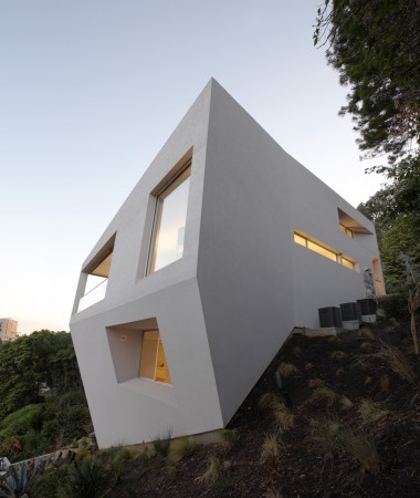
The aperture strategy results from a desire to both minimize the quantity for privacy and efficiency in terms of environmental performance, and to maximize size for views, ventilation and light. With the relationship of the site and building to the street, the conventional rear of the house in essence becomes its front with spectacular views of the canyon and ocean to the north, east, and south. Large sliding glass doors in the living area retract into concealed pockets, erasing boundaries between interior and exterior. Where windows and doors are recessed into the building volume, the exterior material membrane folds into the house to form deep sills and thresholds respectively. The recessed windows of the private rooms frame specific views to the exterior while limiting views into the house. The placement of skylights in both the flat and sloped roofs further blurs the conventional differentiation between roof and wall. Indirect light sources and unanticipated views from these openings further enhance the three-dimensional quality of the space and form.
MATERIALS
To express the continuity of the building skin and minimize the conventional distinctions between roof and wall planes, an elastomeric, cementitious exterior coating material was used requiring no control joints. The embedded lavender color of the coating was sampled from the pigment of eucalyptus bark, prevalent at the site, re-enforcing the house's connection to the site from which its form is derived. The material's iridescent quality results in dramatic color variations with changing light conditions throughout the day. Similar to the monolithic exterior coating, the interior materials are detailed to suggest spatial continuity. Materials in varying shades of white, including polished Carrara marble, smooth Corian countertops, lacquered wood, and enameled steel seamlessly meet throughout occasionally accented by darkly stained walnut flooring and cabinets. A meadow of various native California grasses forms a blanket covering the slope surrounding the house. Highly detailed succulent plants such as aloe and agaves accent the soft grasses and reflect the crisp lines of the house.
STRUCTURE
The structural assembly is composed of concrete, steel, and timber. The foundation, based upon nine 35-foot deep reinforced concrete piles, is anchored into bedrock and tied together by a network of grade beams. Rising up from this foundation, inclined concrete walls project orthogonally to the grade - instead of vertically - taking on the figure of prevented fall. A braced steel frame with timber infill framing emerges out of the concrete base to form the circulation core and cantilevered overhang at the entry.


Blogger Comment
Facebook Comment